Friday, 26 September 2014
Preliminary Task
To produce a front cover for a new school/college magazine and mock up of the layout for the contents page and double page spread.
Wednesday, 24 September 2014
Introduction to Photoshop
I have used photoshop before during my art GCSE, but some of the techniques I used to make this document were unfamilar to me, such as the Feathering Tool and also the Zoom Tool.
To set up the file on Photoshop, I clicked 'File' and then 'New', this then opened up a pop up screen which had all the sizing that you can edit. I changed the width to 800 pixels and the height to 1000 pixels, which changed the resolution but then I edited it to 72 pixels. I did this to make sure that the file wasn't so big and didn't take up a large amount of space as it wasn't especially important.
Using Photoshop can be quite confusing when it is first used, but once you get the hang of remembering where the tools are, it couldn't be easier. The Polygon Lasso Tool was very useful when I wanted to crop backgrounds out of certain images. This tool is situated on the left hand side and is the third button down. It looks like a lasso. Once you have gone round your image, to delete the back ground, you can either press Select-Inverse-Delete or if you want to delete the content within the highlighted area, you can simply just press the delete button. To scale images (make them bigger/smaller) go to Edit at the very top of the desktop page, a drop down will appear, then click Transform and Scale. To make sure your image stays in proportion, when you scale the image, hold down Shift. This will make the image stay in the correct proportion rather than being too wide or too long. The Zoom Tool was extremely useful when I wanted to edit in very fine detail. This tool is situated on the land hand side and near the bottom. It looks like a magnifying glass. Next you left click on the image to zoom in and when you want to zoom out you left click again whilst holding Alt.
Always remember to save you photoshop file as a psd (photoshop file) unless intended to go on a blog of some sort, then you want to save it as a JPEG file, so the image isn't in separate layers.
Monday, 22 September 2014
Mood Board and Color Schemes
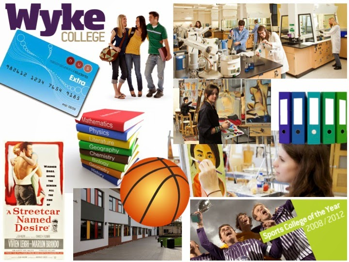
This mood board reflects college life. It has many different subjects so it can apply to a larger group of people, male and female.

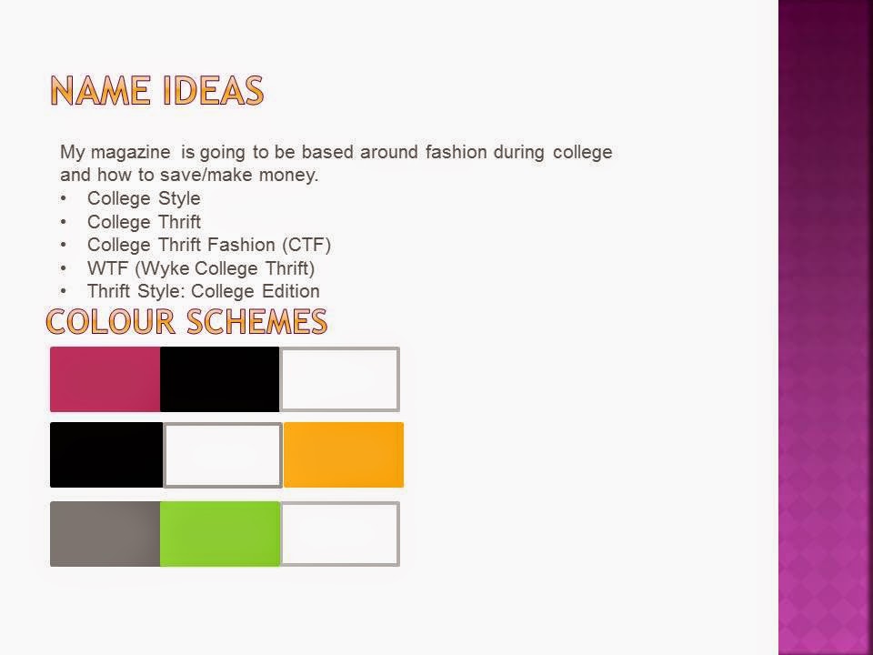
The names and color schemes for my magazine are applicable for a fashion magazine. The colors can reflect simplicity and some are suitable for the female audience and some are suitable for both. The magazine will be directed to both sexes, as this therefore will entice a larger audience.

Friday, 19 September 2014
Semiotics
Semiotics is the study signs, symbols and significations and how we read or perceive them.
On this film cover of Pirates of the Caribbean, there are many different things to analyse such as the creator's choice of color scheme. The black against the orange creates a contrast and makes the scene seem more intensified. The orange makes the objects within the background stand out more.If you have seen these films, you will know the name of the ship is The Black Pearl, and the moon in the backdrop links to the ship as it resembles a pearl, round and white. The smoke or mist in the background creates a mysterious setting and links to certain parts of the film, which for someone who hasn't seen this film, gives them an insight on to what the film will be about.
The placement of people on this film cover indicates the importance of each role within the film. This can also be seen as Johnny Depp is holding a gun and a knife, showing that he is in control as the rest of the cast are stood behind him. This implies that they follow him and are in his power. This is also indicated by the size of Johnny Depp's head as it is significantly larger than the rest. At the top of the film cover, we can see that there is the cast's name and that they are listed left to right, of importance; Johnny Depp is at the beginning as he is the most important and Keira Knightly at the end, showing that she is inferior. Even though this goes against the layout of the actors, it is simple to understand, and if you didn't know who the actors/actress are, it could be easily worked out.
The title of the film cover links with the content of the film, as it signifies the time in which the film is set. It is placed on a scroll or piece of parchment which is what pirates would use as maps etc at this time. The skull within the title also gives an impression of darkness and death, giving insights to what may happen in the film.
The layout and size of the actual film companies name (Disney) is still on the cover of the film but it is placed at the top as it is still an interest to the audience but it probably isn't the first thing they look at when wanting to purchase/watch this film. The size of the logo indicates it's importance also.
The layout and size of the actual film companies name (Disney) is still on the cover of the film but it is placed at the top as it is still an interest to the audience but it probably isn't the first thing they look at when wanting to purchase/watch this film. The size of the logo indicates it's importance also.
Thursday, 18 September 2014
Thursday, 11 September 2014
Magazine Masthead
Wednesday, 10 September 2014
Monday, 8 September 2014
Progress Shots
I am using Photoshop to create my magazine. In this shot I am adjusting the levels in the photograph, so that the black and white tones in the photo stand out more, and to make it brighter and have more depth.
In this shot I am using the PaintBucket Tool as I want a completely white background for my magazine. For this tool, all you have to do is choose a colour from the squares on the bottom of the tool bar, and click where you want that colour to be.
I next added my Masthead 'Thrift'. For this I used to Text Tool, which is the 'T' in the tool bar. For my Masthead I used the font Onyx because it is large and catches your attention. I also added a sub-title using the same tool and placed it underneath.
I took this shot after putting in all of the feature stories and plugs using the text tool and rectangle tool. I got an image of a barcode and placed this in the bottom left corner.
I used the edit-transform-scale tool quite a lot within the making as it is an easy and simple way to change the sizes of my images and rectangles. For my contents page, I added text, using the Text Tool, added photos from my SD Card and used the Rectangle Tool as a background for fonts and titles so they stood out more.
Sunday, 7 September 2014
Evaluation
What have you learnt from completing this task?
During this media task I have learnt many things, some technology based and some more general. Firstly, I have learnt how to take a photograph properly, using the correct ways to frame an image, which I did not know before I started this media course. Secondly, I have become more experienced with Photoshop. I knew basics of the program before, but never into much detail, where I could create a full piece of work on it. At first I fond certain things quite difficult to get a grasp of, but after some practice I became familiar with the tools and how to adjust the photographs using hue/saturation, levels and also scaling, which all came in extremely useful. During this task I have also learnt a large amount about the conventions of a magazine, of which I didn't know about before. Not only what the conventions are, but their purpose on the magazine, and why, if they are variable, affect who buys the magazine or not. I learnt how important colour was when wanting to target a certain age group of people as some colours can offend or just be not to that particular person's taste. The structure of the layout is also important, not only to the company, but to the reader as well. They want the main feature to be the largest thing on the screen, this is so they can see it clearly and know who that person is and the company wants the same thing, as they know it is more likely to attract readers if the audience know who the main feature is about. They will choose someone who is very current in trends , depending on what type of magazine it is. I also learnt that it is important to use a range of fonts and font sizes, as it separates the important from the least important and makes it more fun and exciting. I also learnt how to successfully set up and blog and work to a strict deadline, as at school, they were much more lenient.
How have you used technology?
I have used technology in many ways when creating my magazine. This included using the Apple Macs for research and creating my conventions of analysis. At first I found these computers difficult to use, as the shortcuts keys are different to a normal PC, which was quite time consuming, as i spent some time trying to figure out what was what. I also used a normal PC computer, which I found was much easier to use and I got a lot more done in the same amount of time. I used the internet to research before i started to create my magazine and also to create and update a blog daily. This was more useful than writing all of my coursework down, as i knew it was all in one place and could be easily accessed. Also there is no fuss about handwriting and it being scruffy as it is all done on the computer. Another form of technology I used were cameras. I used these to take my images for my magazine but also for some work on my blog, discovering different camera frames and angles. I also used the camera on my phone to take some images. which I then had to use the internet to email to myself so I could use them on my blog. My SD card from my camera was also used in the Mac computers by placing it in the SD slot in the back of them computer. This then transferred all the images that I wanted and had selected and imported them onto my account. As I forgot to save them to my memory card, when I was working on the normal PC's, I couldn't access them photos. I did save everything else onto my memory card though and was accessible anywhere. Photoshop played a major part in my creation of my magazine, so this was probably the most important and advanced piece of technology I used.
What conventions have you used and why?
The first convention that I put onto my magazine was the Masthead. This is because I felt like it is one of the most important conventions on a magazine, as it plays a large part in attracting a certain audience. If they are familiar with the Masthead then they are more likely to buy it with confidence, knowing that they content of the magazine will be what they were looking for. Secondly, I put in the image that I had chosen to use. This was a medium close up and I placed it more to the right hand side of the magazine as it gave me room to put my feature stories down the side of it. The image was of a college student, holding an arrangement of books and folders. I did this as I knew that the magazine was targeted for college students, and this would be more approachable and again they would know what the content was most likely going to be about, rather than it being about something that wasn't relevant to their situation. Furthermore, I then went to place my feature stories and the plug down the side of the image. The plug slightly overlapped the image and consisted of a prize wardrobe makeover, as I thought it was relevant, because lots of students struggle with money, but also finding their own clothes style, withing a certain price range. I did the feature stories in different fonts and sizes depending on their importance. These are used to entice the reader more, as it is extra information that they would most likely be interested in, depending on what type of magazine it is. I also put the main feature in big bold font, so you knew that it was linked to the main image. After that I put in the header and footer, which consisted on additional information, prizes and tips, which are what some college students need or want. These further attract readers, they may be able to save money, which is what college students want. Finally I put in the barcode and price. This is because it is still important as it is essential when buying a magazine, but it is most definitely the last thing the reader would look at when wanting to buy a magazine. If the price is too high, they would probably not buy it so I made it a reasonable price of £1.50.
What would you change if you were to do this task again?
If I were to do this task again, I would change a few things, as everything can be improved some way or another. The first thing I would do is to ask more questions in class or ask my teach privately. As it was our first task, I didn't want to be the only one asking the simple questions. Also if I were to do it again, I would have more confidence in myself that I was doing the task correctly. Now that I am more comfortable within my class, I would be more willing to put my hand up and ask questions as well and stay behind to ask things that I was uncertain of, instead of trying to figure it out myself. I would also do more work outside of lessons, so then when it is coming closer to the deadline, I am not as stressed or panicking that I won't finish in time. It'd be nice, to when things get more difficult, for me to not be stressed and be up to date with everything that is going on. The next thing that I would do slightly differently, would be to take more time and effort with my blog, making it look more presentable and professional. This could of been done within this task, but as it was the first, I was more concentrated on getting the content correct rather than what my blog looked like. Finally, I would of done a bit more research and took more photographs, just in case any disappeared from my SD card, which they did in this task, and I had to then go and take more, but if I had back up images. I wouldn't of had to do this and probably saved more time. I would also take all of my images on the camera, rather than on my phone, as I felt it took too long to have to email them to myself, as phones can be very fidgety having such a small screen compared to a computer.
Saturday, 6 September 2014
Subscribe to:
Comments (Atom)


